Sorry your browser is not supported!

You are using an outdated browser that does not support modern web technologies, in order to use this site please update to a new browser.

Browsers supported include Chrome, FireFox, Safari, Opera, Internet Explorer 10+ or Microsoft Edge.

Geek Culture / --== Calling all artists - Geisha House GUI art needed. Image intensive! ==--

Author
Message
Cash Curtis II
19
Years of Service
User Offline
Joined: 8th Apr 2005
Location: Corpus Christi Texas
Posted: 15th Jun 2007 11:25


It's time for me to ask for help again. The last time I did this it turned out so fantastic great. Green7 did the artwork above, which has become the face of Geisha House.

If you aren't familiar with this game, then shame on you, click my sig at the bottom to see the wip. Or cruise on over to http://www.youtube.com/cashcurtis and check out some videos of the game in action. Combat Revisited and Mega Magic are cool, and this shows the Conversation System in action.

So, Geisha House has two publishers interested in distributing the games. Both of their terms are the same, but their channels of distribution differ a little. It will really come down to what they think of the demo how it will get handled, and in turn who I choose to go with.

Right now I'm using hijacked Ultima Online runes for my magic system. I need new ones for the game, and that's where I hope someone can help me out. I'm also going to need some new graphics for packs, bags, crates, and books.

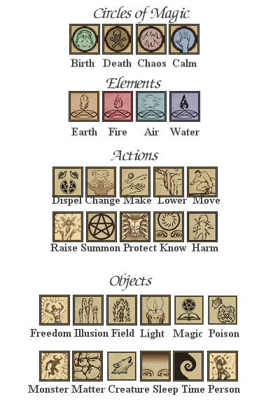
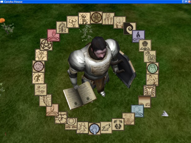
Here are my existing runes. There are 4 circles of magic - Birth, Death, Chaos, and Calm. There are 4 elements (earth, fire, air, water). Beyond that there are actions, targets, and objects. When you string runes together it creates a spell...


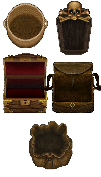
Game packs (here's everything I need except for a barrel and a wooden crate)

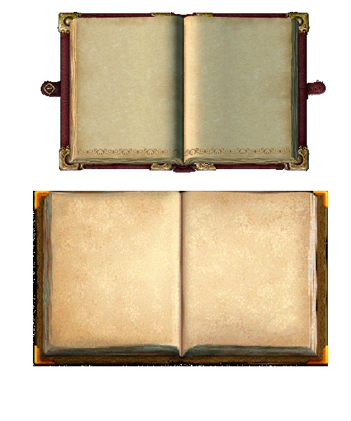
Game books. Top one is a spellbook and the bottom one is a regular book. Here's the catch - the final versions have to be the same size and the pages have to be the same dimensions. I overlay the book pages onto the books. I'll also need little dogeared corners to indicate that you can turn a page.

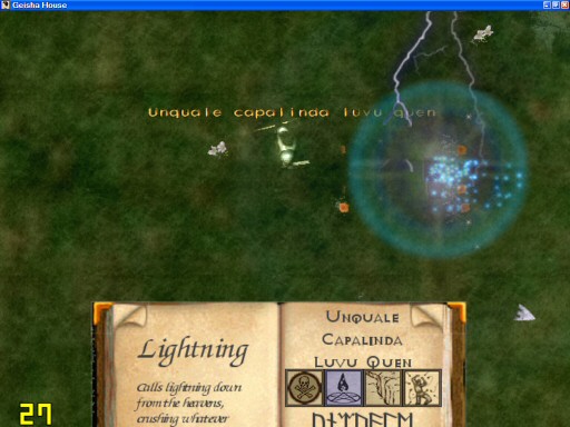
Here's an example of the spell system in action. It's in all of the magic videos as well...

And here's the spellbook, right in the middle of casting a Lightning spell.

********************************************************

So here's the deal. If you're interested in taking on such a big job and have the time to do so then let me know. Although this is getting published I don't expect to do much more than break even. I've spent a lot of money on this already and am hoping for the good will of you artists It goes without saying that the artist will be credited. It won't be some lame fine print credit either, your name will be very visible.

If you want to take part in this, make and post a small example here. Maybe a couple runes and a pack, then we can take it from there.

One thing that I want to remain consistent is the color scheme. I purposely colored the circles and elements to stand out from the rest. They also need to be clear - real art is way better than computerized effects.

They don't need to be Japanese at all. They don't even have to perfectly show the meaning of the rune. They need to be different, recognizable, and nice looking. When a player sees an icon they should be able to associate its meaning to it. 'Poison' doesn't have to be poison exactly, but it should be close enough that players will associate it with poison. It could be someone dying of posion, or a deadly looking cloud.

Right now I love some of the icons. 'Protect' looks great. It just looks like someone is being protected by that. 'Change' looks like junk and 'Raise' doesn't fit. I can never find those two when I'm casting spells.

The final size of the spell runes will be 44x44. The final size of the packs will be 256x256. Right now the book is 422x252 (for no particular reason). That isn't really important though, all that matters is that different books have the same relative page layouts.

Oh, and don't be afraid to use pentagrams and other pagan symbols

I hope you guys are interested. Geisha House will be a great game, I promise I look forward to seeing the art!


Come see the WIP!
Zombie 20
17
Years of Service
User Offline
Joined: 26th Nov 2006
Location: Etters, PA
Posted: 15th Jun 2007 13:49
I hope you know i'm crying right now cash, with the lack of a scanner my services are rendered useless. Not fair that would have been really fun. Well hey good luck and I know it will turn out great.

Cash Curtis II
19
Years of Service
User Offline
Joined: 8th Apr 2005
Location: Corpus Christi Texas
Posted: 16th Jun 2007 09:05
@Zombie 20 -
Borrow a friend's scanner


Come see the WIP!
Inspire
17
Years of Service
User Offline
Joined: 23rd Dec 2006
Location: Rochester, NY
Posted: 16th Jun 2007 09:45
Really Cash, I would love to take this on, but I already am working on 5 games....

Cash Curtis II
19
Years of Service
User Offline
Joined: 8th Apr 2005
Location: Corpus Christi Texas
Posted: 16th Jun 2007 09:50
Quote: "I already am working on 5 games...."

Good Lord! Ignoring this post, I think that's way too much. I'm only working on 1 game and that's hard enough. I think that the addition of projects exponentially decreases your chances of success.

Back to this post, Geisha House is the most important. I'd forgive you if you dropped all of your others for this


Come see the WIP!
tha_rami
18
Years of Service
User Offline
Joined: 25th Mar 2006
Location: Netherlands
Posted: 16th Jun 2007 14:31
I have to disagree, Cash, but primarily because Inspire is working along on SeaDome, which is ofcourse far more important.

I fully agree multiple projects decrease your chance on succes rapidly, though, therefore I dropped Awakening. Therefore, I'm also unable to help along here.

Daniel TGC
Retired Moderator
17
Years of Service
User Offline
Joined: 19th Feb 2007
Location: TGC
Posted: 16th Jun 2007 20:43
Sorry, I'd be interested in helping out, but you've pretty much completely negated any chance of being paid, even if does make money. If you don't make money, fine, but if you do, then an accreditation is poor reward.
Cash Curtis II
19
Years of Service
User Offline
Joined: 8th Apr 2005
Location: Corpus Christi Texas
Posted: 16th Jun 2007 20:58
Quote: "SeaDome, which is ofcourse far more important"

I'll concede that they're the same

@Daniel TGC -
If I make money off of this project then I'd definitely share the profits with people that have made substantial contributions. The problem is that I can't promise something that I can't definitely deliver. One of my issues is that I have two monetary boundaries to cross - first of all my own costs, then the publisher's initial costs. If I'm able to meet those requirements, I'd be obligated to share.

Accreditation in a commercial project is no small thing. This sure isn't a big budget title, but it will be published commercially nonetheless, and thus will become a permanent part of an aspiring game developer's resume. It is certainly not as appealing for all, yet certainly has value.

I definitely appreciate your interest


Come see the WIP!
Inspire
17
Years of Service
User Offline
Joined: 23rd Dec 2006
Location: Rochester, NY
Posted: 16th Jun 2007 21:11
Quote: "Good Lord! Ignoring this post, I think that's way too much. I'm only working on 1 game and that's hard enough. I think that the addition of projects exponentially decreases your chances of success."


But it means that you are always making progress. Whenever you get stuck in a rut with one game, switch to another until you have your motivation back.

Quote: "So, Geisha House has two publishers interested in distributing the games. Both of their terms are the same, but their channels of distribution differ a little. It will really come down to what they think of the demo how it will get handled, and in turn who I choose to go with."


I'm definitely going to buy this when it is finished.

Scraggle
Moderator
21
Years of Service
User Offline
Joined: 10th Jul 2003
Location: Yorkshire
Posted: 17th Jun 2007 03:16 Edited at: 17th Jun 2007 03:22
Are these OK for you?

The download has a RAR file containing PNG images with transparent backgrounds with and without dog-eared corners.


Attachments

Login to view attachments
RUCCUS
19
Years of Service
User Offline
Joined: 11th Dec 2004
Location: Canada
Posted: 17th Jun 2007 05:07 Edited at: 17th Jun 2007 05:08
Maybe these will inspire something, just random ideas;


Attachments

Login to view attachments
dark coder
22
Years of Service
User Offline
Joined: 6th Oct 2002
Location: Japan
Posted: 17th Jun 2007 06:57
Well I agree that having say two projects i.e one main one and something on the side helps because I just can't find the motivation to work non stop on just one project, if I do that then I'll just get tired of it so it's nice to have some options(it's not like a job where you're forced to work on something after all ). I'm in a Battlefield 2 mod which allows me to make media and I can see progress in game pretty fast, it's a nice stress reliever IMO, however 5 projects is far too much and I don't see the point of that.

Dave J
Retired Moderator
21
Years of Service
User Offline
Joined: 11th Feb 2003
Location: Secret Military Pub, Down Under
Posted: 17th Jun 2007 07:26
Just an opinion, but from watching a couple of the videos you might want to try adjusting the camera angle down 30 - 45 degrees because at the moment the relatively close top-down view feels very claustrophobic and doesn't give any real insight to what's around you.


"Computers are useless, they can only give you answers."
indi
22
Years of Service
User Offline
Joined: 26th Aug 2002
Location: Earth, Brisbane, Australia
Posted: 17th Jun 2007 07:56
nice work scraggle kudos

Cash Curtis II
19
Years of Service
User Offline
Joined: 8th Apr 2005
Location: Corpus Christi Texas
Posted: 17th Jun 2007 09:02
@Inspire -
I can see that point to a small extent. What dark coder says is a good idea, I think. Five projects is just way too many. One project is hard enough to complete. If I'd been working on 5 at once, at the most I'd be 1/5th of the way along with GH. Probably less since switching is less efficient.

What I do to break up the monotony of coding is to go on modeling breaks. I might model for a week or two and produce lots of great stuff. Then I can get right back to coding and be further along.

@RUCCUS -
Haha That made me laugh when it popped up. I always like your style.

@dark coder -
That sounds like a good combination. I think that working on two complete projects (game engine+media) would be too much, of course. I have taken two breaks from Geisha House to work on paid projects, I suppose that helped break up the monotony of the job as well.

@Dave J -
You can zoom the camera in and out and change the camera angle. I often zoom in during video recording just so that people can see more detail. It's not all that playable when the camera is right in his face, I'll definitely agree with that.

@Scraggle -
Nice work, I really appreciate it! I'll put those in the game immediately.

@Everyone - I appreciate your interest!


Come see the WIP!
Jess T
Retired Moderator
21
Years of Service
User Offline
Joined: 20th Sep 2003
Location: Over There... Kablam!
Posted: 17th Jun 2007 09:08 Edited at: 17th Jun 2007 09:08
In much the same vein as RUCCUS' work...


Nintendo DS & Dominos :: DS Dominos
http://jt0.org

Attachments

Login to view attachments
Inspire
17
Years of Service
User Offline
Joined: 23rd Dec 2006
Location: Rochester, NY
Posted: 17th Jun 2007 10:08
Quote: "I can see that point to a small extent. What dark coder says is a good idea, I think. Five projects is just way too many. One project is hard enough to complete. If I'd been working on 5 at once, at the most I'd be 1/5th of the way along with GH. Probably less since switching is less efficient."


Yeah, you're right. I'm only actively working on two, but I'm still working on the other ones, just not nearly as much.

Quote: "What I do to break up the monotony of coding is to go on modeling breaks. I might model for a week or two and produce lots of great stuff. Then I can get right back to coding and be further along.
"


Too bad I'm the modeler and texturer for my games...

And wow, those are really good, Scraggle.

Scraggle
Moderator
21
Years of Service
User Offline
Joined: 10th Jul 2003
Location: Yorkshire
Posted: 17th Jun 2007 10:39 Edited at: 17th Jun 2007 10:40
I just realised that I only applied the dog-eared corner to the left page and looking at your image you would need to have the option to have it on both.

So here is a dog-ear that you can overlay on to either one of the books. Simply mirror the image for the opposite page.


Attachments

Login to view attachments
Cash Curtis II
19
Years of Service
User Offline
Joined: 8th Apr 2005
Location: Corpus Christi Texas
Posted: 17th Jun 2007 11:17
@Jess T -
My first thought was that he was a doctor delivering a baby, thus 'birth' Too bad this isn't GH's style or I'd have my artwork handles already.

@Inspire -
I always recommend reducing. I mean, if you aren't really working on a project, then it won't really get finished. I've got a couple awesome projects planned out, with concept art and detailed plans, but I dare not start on one of them yet. It will still be about a year before I can work on a different project. It kind of sucks but it keeps me on track.

@Scraggle -
Thanks. That one is perfect, it's the same as the one I'm using right now. Hey, did you get a chance to look at the plugin yet?


Come see the WIP!
Scraggle
Moderator
21
Years of Service
User Offline
Joined: 10th Jul 2003
Location: Yorkshire
Posted: 17th Jun 2007 11:30 Edited at: 17th Jun 2007 11:40
Quote: "it's the same as the one I'm using right now."

It can't be, I just made it

Are these any use or too colourful?


I haven't had chance to look at your plugin yet ... sorry. I have just got Photoshop CS3 and have been busy seeing what it can do. I will look at it some time today though, thanks


Cash Curtis II
19
Years of Service
User Offline
Joined: 8th Apr 2005
Location: Corpus Christi Texas
Posted: 17th Jun 2007 11:42
I like them, but not quite what I'm looking for. Imagine if you will that the runes are little cutout pieces of parchment with a hand drawn picture, and some just a touch of color to differentiate them. Your runes look great, but they have a bit too much color and 3D looking effects going on.

No worries with the plugin, I was just wondering


Come see the WIP!
Scraggle
Moderator
21
Years of Service
User Offline
Joined: 10th Jul 2003
Location: Yorkshire
Posted: 17th Jun 2007 11:55
More like this?


Cash Curtis II
19
Years of Service
User Offline
Joined: 8th Apr 2005
Location: Corpus Christi Texas
Posted: 17th Jun 2007 11:58
Yes, that's right on the money


Come see the WIP!
Jess T
Retired Moderator
21
Years of Service
User Offline
Joined: 20th Sep 2003
Location: Over There... Kablam!
Posted: 17th Jun 2007 12:37
You realize that runes are actually a sort of alphabet, yeah?

Rune

Otherwise, you should probably call them inscribed stones or somesuch (keep it as Runes in the game, just explain it differently to the artists ).

Nintendo DS & Dominos :: DS Dominos
http://jt0.org
Scraggle
Moderator
21
Years of Service
User Offline
Joined: 10th Jul 2003
Location: Yorkshire
Posted: 17th Jun 2007 12:52 Edited at: 17th Jun 2007 13:03
Could you explain what Field, Person and Change do?

Field looks like a person on fire but suggests perhaps a shield, but then that would be confused with Protect.

Person looks like a person under attack which seams to be the same as Harm.

Change I have no idea about. Is it some kind of metamorphosis, and if so is it you into something or an object into another?

[Edit]
Also Raise & Lower

Your current icons are a bit confusing because Raise looks like an angel ascending, so perhaps raising the dead? And Lower looks like a fracture in the Earth, so perhaps lower the terrain?

I'm sure they must be raising & lowering the same thing, I just don't know what it is.


Dave J
Retired Moderator
21
Years of Service
User Offline
Joined: 11th Feb 2003
Location: Secret Military Pub, Down Under
Posted: 17th Jun 2007 13:19
Nice work Scraggle, those are fantastic!


"Computers are useless, they can only give you answers."
Scraggle
Moderator
21
Years of Service
User Offline
Joined: 10th Jul 2003
Location: Yorkshire
Posted: 17th Jun 2007 14:04 Edited at: 17th Jun 2007 14:15
Thanks Dave.

How are these Cash?

I didn't like the original Freedom, it looked more like he was under attack. So, here are a couple of suggestions.


I have assumed that change is: Change one object into another.
I still need confirmation as to what Lower, Raise, Field & Person should be ... that is if you are interested. If you don't like them I will stop.

Protect is hideous! I will change that if you like.


Raven
19
Years of Service
User Offline
Joined: 23rd Mar 2005
Location: Hertfordshire, England
Posted: 17th Jun 2007 14:53
you might want to think about the book and item boxes being 3D, as it would help add some nice depth.. plus wouldn't have that static feel that you get from games like diablo.

well anyhow, did some quick icon concepts.
they're based on european idea runes, they're quite clean in design although not sure about some.. wasn't too much thought put in really. tried to keep a similar theme for the "person" idea, but some cases not sure how well that worked.

if you like them then i can do the vector art tonight, only one missing i think is illusion cause after a minute of thinking how to do it.. just came up blank

Attachments

Login to view attachments
Cash Curtis II
19
Years of Service
User Offline
Joined: 8th Apr 2005
Location: Corpus Christi Texas
Posted: 17th Jun 2007 17:33
@Jess T -
Yeah, I know. I should have explained that better. I'll keep them as runes in the game, of course. It seems to fit with what they do.

@Scraggle -
Awesome work Scraggle!!

Quote: "Could you explain what Field, Person and Change do?"

Field can be a field of any type. It could be a fire field that would burn you, or it could be a field of protection which would stop something else from entering you. It would depend on the other runes in the spell - for example, Calm + Protect + Field would be quite different from Chaos + Fire + Field.

Person simply designates a person as a target. The icon I had looked nice, but didn't fit. Change simply will change one thing into another. You'd have to specify what you're changing - Person, Matter, Monster, etc.

Quote: "Also Raise & Lower"

Like I said, I was stealing icons, and not all of them fit at all. Raise and Lower were two of those. Lower and Raise can apply to anything. Raise can raise you up in the air, or could raise some other attribute. The same can go for Lower. So, anything that makes you think of raising and lowering would be good.

As for the runes so far, I have a couple of suggestions.
Freedom - I like the guy. But, let's add some chained shackles to his arms, with the chains broken. I think that would get the meaning across.

Dispel - It's a great looking picture, but doesn't say 'Dispel' to me. The original one was one of the few that I thought really fit, and I like the pagan association.

Protect - Again, one of the few that I liked the original. Maybe something along those lines?

Creature / Monster - They seem too close to each other. Perhaps use the Creature in the Monster's place, because it appears to be a monster and is a little clearer. Then perhaps a bear rearing back for Creature?

Summon - Perhaps for this one we could have a pentagram with three dragon's heads emerging from the body of the pentagram. That has 'Oh crap' written all over it I love the wizard, maybe we could put him in Magic casting a spell. He just doesn't seem to be summoning much.

I love the style, it is exactly what I wanted. I really appreciate your help with this.

@Raven -
Those are some very interesting concepts. They seem like the start of a runic alphabet. Unfortunately I'm not trying to do anything so complicated, my main concern is having icons that are easily identifiable by the player. I appreciate the ideas and more ideas are always welcome.


Come see the WIP!
Scraggle
Moderator
21
Years of Service
User Offline
Joined: 10th Jul 2003
Location: Yorkshire
Posted: 18th Jun 2007 02:04
How's this?


Gil Galvanti
19
Years of Service
User Offline
Joined: 22nd Dec 2004
Location: Texas, United States
Posted: 18th Jun 2007 04:05
Those look awesome Scraggle . How do you make them?


Cash Curtis II
19
Years of Service
User Offline
Joined: 8th Apr 2005
Location: Corpus Christi Texas
Posted: 18th Jun 2007 06:30
Awesome! I absolutely love them

I have only the tiniest feedback, they're nearly perfect. For Freedom, It's a bit hard to understand what he's doing. It looks like he's breaking some type of arch.

Maybe if he had an arm shackle around each wrist, and a length of chain attached to each shackle hanging past his elbows. Then it would be evident that he'd just broken his shackles. What will really make it good is if you can see the chain links.


The type of shackle I have in mind is just an arm shackle that joins the hands together with a length of chain. For the sake of the artwork the chain would need to be a bit longer than it looks in that picture above.

Fabulous work Scraggle. I can't wait to put these in the game


Come see the WIP!
Scraggle
Moderator
21
Years of Service
User Offline
Joined: 10th Jul 2003
Location: Yorkshire
Posted: 18th Jun 2007 10:44
It is very difficult to portray the level of detail you are asking for at the size you want.

I always work at a larger size than needed and then shrink to fit and at the large size it is pretty obvious but when shrunk ... not so much.

Anyhoo, is this ok?


Jess T
Retired Moderator
21
Years of Service
User Offline
Joined: 20th Sep 2003
Location: Over There... Kablam!
Posted: 18th Jun 2007 10:55
Could you not make the links of the chain a little thinner? So when it's scaled down you can see it slightly better?
Although, that might take away from the whole chain-look by reducing its volume...

I dunno, worth a shot, though

Nintendo DS & Dominos :: DS Dominos
http://jt0.org
Scraggle
Moderator
21
Years of Service
User Offline
Joined: 10th Jul 2003
Location: Yorkshire
Posted: 18th Jun 2007 12:37
Perhaps this is a little more obvious?


Kentaree
22
Years of Service
User Offline
Joined: 5th Oct 2002
Location: Clonmel, Ireland
Posted: 18th Jun 2007 13:23
Cash Curtis II
19
Years of Service
User Offline
Joined: 8th Apr 2005
Location: Corpus Christi Texas
Posted: 18th Jun 2007 14:13
Absolutely perfect Scraggle. I can totally tell what's going on there. The exaggerated chain links are just the thing to make that one work.


Come see the WIP!
greenlig
21
Years of Service
User Offline
Joined: 30th Aug 2003
Location: Melbourne
Posted: 19th Jun 2007 07:51
Brilliant stuff scraggle!!

Hope this all goes well for you cash. We have been following the progress and Alan wishes you all the best in it!

Regards,
Zac

Blender3D - GIMP - WINXP - DBPro
Cash Curtis II
19
Years of Service
User Offline
Joined: 8th Apr 2005
Location: Corpus Christi Texas
Posted: 19th Jun 2007 16:17
@Scraggle -
I didn't mention, but I meant to, I really like how you blended the colors on the Elements. It looks perfect, like the poor monk that made it used watercolor on the parchment.

@greenlig -
Thanks! Tell Alan and Leoni and other-Zac that I said hi I'm really glad that you and Alan convinced me to improve the lighting, the lighting + shaders have really brought everything to life.


Come see the WIP!

Login to post a reply

Server time is: 2024-11-18 19:50:09
Your offset time is: 2024-11-18 19:50:09