Sorry your browser is not supported!

You are using an outdated browser that does not support modern web technologies, in order to use this site please update to a new browser.

Browsers supported include Chrome, FireFox, Safari, Opera, Internet Explorer 10+ or Microsoft Edge.

Geek Culture / Logo design contest for Geisha House - Don't miss it!!

Author
Message
Cash Curtis II
19
Years of Service
User Offline
Joined: 8th Apr 2005
Location: Corpus Christi Texas
Posted: 22nd Aug 2006 03:50 Edited at: 27th Aug 2006 22:39
I know this is old news, but on the off chance you haven't heard, Geisha House is being picked up by a commercial publisher. The good folks over at http://www.xinginteractive.nl/ are the heros. They have retail distribution in 32 countries, including places like Wal Mart and CompUSA. Now, I have no idea how they'll choose to distribute the game, but I don't doubt that it will be good.

I chose the logo in my signature image when I started this project because it was a fast and compelling image. However, I can't use it, and I need new artwork for the game.

I'm looking for not only a logo, but artwork that we can use in other places too, like the game box and the game title screen. Basically, the start of a common artwork theme.

The entire theme of the game is beauty that masks evil. A type of evil that you aren't even sure is bad, that you want to believe is good. I do not want things like daggers and red eyes though. It should be subtle.

You can click on my signature picture or my web page to see more of the game. There's plenty of game screens, so it should give you an idea of what's going on. Of course, don't hesitate to ask questions.

In the end, artistic license will rule. Be creative, and take your time. I'd rather see one good piece than 20 bad ones. I can't wait to see what you guys come up with!

This logo design contest will run for one week. If you need an extension for some uber project you have in the works, just post here or e-mail and I'll be happy to comply. The work is more important than the rules

**************************************


Here's a few images that someone might find useful...
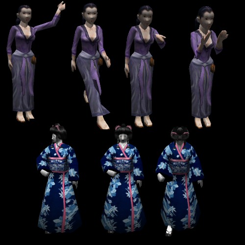
The pretty Japanese girl is from Chenak's wonderful model that he made for this game. The Japanese man in drag is from DarkMatter 2. That one might needs Chenak's touch

Download of the original PNGs...
http://forum.thegamecreators.com/xt/xt_apollo_download.php?i=978916

**************************************

EDIT, 26 Aug 06


Okay, here is the Japanese style building. Someone might find it useful. I promised Steve J I'd do it, so I'm going to make it available to everyone.
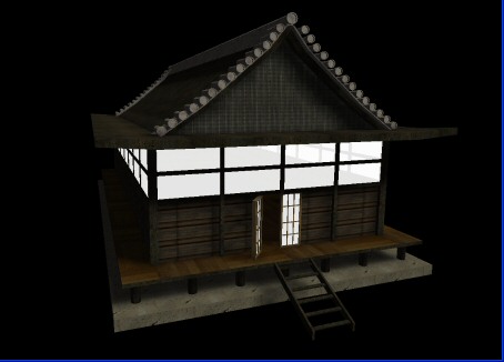


There are two versions, lightmapped .dbo and plain .x. There's a flythrough demo, uncompiled. It's about a 2.5 mb download. I'm also posting the link on the first page.

It weighs in at a hefty 16,444 polygons. It's because of the roof detail, it was 6k before I started that mess. That's why the roof is a little bare, but it looked okay. It's the model in the background of this picture...
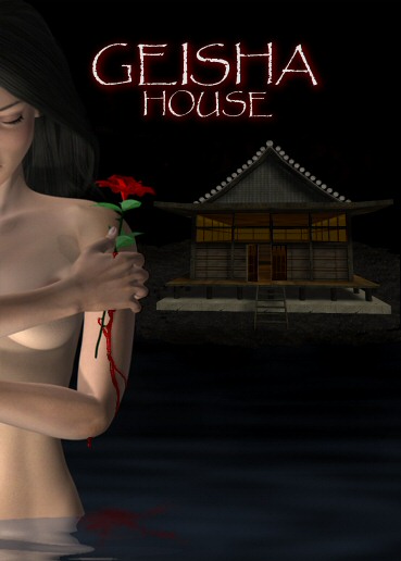


Here's the download link.
http://www.cashcurtis.com/models/Pagoda-3dsandMS3D.rar

Now anyone who wants to use the model in a 3D render can do so. That means you, Green7!

Enjoy!


Come see the WIP!

Attachments

Login to view attachments
Xenocythe
19
Years of Service
User Offline
Joined: 26th May 2005
Location: You Essay.
Posted: 22nd Aug 2006 04:23
Cool

I made one for the logo and one you can use where ever you like

Applyby has Flies in his Eyes.

Attachments

Login to view attachments
Xenocythe
19
Years of Service
User Offline
Joined: 26th May 2005
Location: You Essay.
Posted: 22nd Aug 2006 04:24
Other one...

Applyby has Flies in his Eyes.

Attachments

Login to view attachments
Drew G
User Banned
Posted: 22nd Aug 2006 04:28
Hey... Geisha House is going commercial? Wow, great job Cash, you'll be working for a Commericial Company someday. I'm totally impressed with your work.
Wiggett
21
Years of Service
User Offline
Joined: 31st May 2003
Location: Australia
Posted: 22nd Aug 2006 04:30
here is one I did, i put a spin on it though to try and open it up to a wider market. I added in some slang and gave it a bit of attitude which I think opens it to the broader market of extreme gamer's out there.


Syndicate remastered: Corporate persuasion through urban violence.
Drew G
User Banned
Posted: 22nd Aug 2006 04:45
Dude, Wiggett, you seriously need to get out more. And away from your TV.
Megaton Cat
21
Years of Service
User Offline
Joined: 24th Aug 2003
Location: Toronto, Canada
Posted: 22nd Aug 2006 04:50
Rob: You need to re-fill on your funny down at the funny station.
SageTech
19
Years of Service
User Offline
Joined: 3rd Dec 2004
Location: Orlando, Florida
Posted: 22nd Aug 2006 04:52
Quote: "Rob: You need to re-fill on your funny down at the funny station."


Pfft, that emits to much sarcasm. I run on 100% Dry Humor, beat that!

Back by unpopular demand!
Battle Legacy has gone MMORPG! Nah, Im just kidding. But seriously, check the WIP

Cash Curtis II
19
Years of Service
User Offline
Joined: 8th Apr 2005
Location: Corpus Christi Texas
Posted: 22nd Aug 2006 05:00
@Xenocythe -
The first one isn't too bad, except for the text. It's rather Attack of the Killer Tomatoish. It should be cleaner, and simpler

The second one isn't really what I'm looking for. I need something compelling, that just seeing will make people want to play the game. Like a movie poster.

@Wiggett -
Haha. In the Geisha Hizouse!

@Drew G -
Welcome back. Don't bring your attitude into my thread. Wiggett's picture made me smile, and there's nothing wrong with it.


@SageTech -
Quote: "Pfft, that emits to much sarcasm. I run on 100% Dry Humor, beat that!"

Haha

***********************************************************

Remember guys, sex sells, but porn scares away. Don't be afraid to put a little feminism into it Think - movie poster.


Come see the WIP!
Steve J
18
Years of Service
User Offline
Joined: 22nd Apr 2006
Location: Vancouver, Washington
Posted: 22nd Aug 2006 12:25
Is this ok?

http://www.milkpaton.com/
http://phoenixophelia.com
SteveJ, less, and less Controversial!

Attachments

Login to view attachments
Van B
Moderator
22
Years of Service
User Offline
Joined: 8th Oct 2002
Location: Sunnyvale
Posted: 22nd Aug 2006 13:08
G'luck Cash, and well done with the publisher.

I think what is needed is something simple, no screenshot, no automated 3D filters, think Lionheads usual logo style and you'll have something more professional.

How about a yin-yang with geisha house around it like a feng-sui Dharma symbol. C'mon guys put in some effort!.

''Stick that in your text and scroll it!.''
Fallout
22
Years of Service
User Offline
Joined: 1st Sep 2002
Location: Basingstoke, England
Posted: 22nd Aug 2006 13:34
Cash, maybe you should take some more screenies, high res ones, and good poses of character models etc. Give the peeps some building blocks to work with to create a scene etc. Might help ensure it's along the right lines, plus then you're less at risk from people using copyright images from the net etc. Just an idea chap.

Zappo
Valued Member
20
Years of Service
User Offline
Joined: 27th Oct 2004
Location: In the post
Posted: 22nd Aug 2006 15:18
Heres one which needs some work. Its perhaps a little complex but it can be simplified.

If you like it Cash, I can work on it some more. Any suggestions are welcome.

Attachments

Login to view attachments
Zappo
Valued Member
20
Years of Service
User Offline
Joined: 27th Oct 2004
Location: In the post
Posted: 22nd Aug 2006 15:26
Sorry, that last one was more like 'cover artwork'. This is the logo on its own.

Attachments

Login to view attachments
Wiggett
21
Years of Service
User Offline
Joined: 31st May 2003
Location: Australia
Posted: 22nd Aug 2006 16:41
lol my picture was a stab at the gaming industry not cash's game, i am all for his getting picked up by a publisher, congrats!

Syndicate remastered: Corporate persuasion through urban violence.
Drew G
User Banned
Posted: 22nd Aug 2006 20:46
@ Cash
I'm sorry if you took my reply to Wiggett the wrong way, I mean, it was meant sarcasatically, as well as reality the same time. I wasn't trying to be head strong or anything.
Oddmind
20
Years of Service
User Offline
Joined: 20th Jun 2004
Location: Atlanta, Georgia
Posted: 23rd Aug 2006 04:54
I'll hook you up cash, gimme a few hours.

formerly KrazyJimmy

Prayers for rain...
Alquerian
18
Years of Service
User Offline
Joined: 29th Mar 2006
Location: Reno Nevada
Posted: 23rd Aug 2006 08:05
I will need a week or two.

@Oddmind - I just purchased that book earlier today. Taking my first art class in 10 years, its called drawing on the right side of the brain or something. Can't wait to see everyone's entries.

"We are what we repeatedly do. Excellence, therefore, is not an act, but a habit." - Aristotle
Cash Curtis II
19
Years of Service
User Offline
Joined: 8th Apr 2005
Location: Corpus Christi Texas
Posted: 23rd Aug 2006 13:16 Edited at: 23rd Aug 2006 13:23
@Steve J -
Nice picture I'll post about what we talked about later in the post.

@Van B-
Quote: "G'luck Cash, and well done with the publisher."

Thanks! I totally agree about a simple logo. Also though, I'm looking for advertising art, like you might find in a movie poster. It's like V for Vendetta - The V with the circle is the logo, emblazoned upon a poster with Natalie Portman's face.

@Fallout -
Quote: "Cash, maybe you should take some more screenies, high res ones, and good poses of character models etc. Give the peeps some building blocks to work with to create a scene etc."

You got it. I'll explain in a second

@Zappo -
Looking nice. I like the second one the most. However, the font is a bit horror movie-ish. Nice simple and strong graphics though.

@Drew G -
Quote: "I'm sorry if you took my reply to Wiggett the wrong way"

It's all good, let's just be cool about everything. Your comments are more than welcome, so long as you aren't starting fights or insulting people.

@Wiggett -
Quote: "lol my picture was a stab at the gaming industry not cash's game, i am all for his getting picked up by a publisher, congrats!"

I liked it Thanks! I'm still mostly surprised about the publisher.

@Oddmind -
Quote: "I'll hook you up cash, gimme a few hours."

Do your thing

@Alquerian -
Quote: "I will need a week or two. "

No worries, I'm giving everyone two weeks.

**********************************************


You guys have a great point, I should have started this with a bit more media. I've attached some high resolution PNGs to the first post, and a thumbnail JPG of the images. Download them, hopefully they're of use to someone.

Also, in the next day or two, I'll model a Japanese style house, in case anyone wants to render a scene with it, or just use the image as it is displayed in DBP. I'll include a lightmapped version and a non-lightmapped one. I'll post it in this thread for everyone to download and use.

Please, please, everyone, don't be afraid of making your own drawings or vector graphics. Original artwork will blow away screen captures of game models.

That's all for now!


Come see the WIP!

Attachments

Login to view attachments
Wiggett
21
Years of Service
User Offline
Joined: 31st May 2003
Location: Australia
Posted: 23rd Aug 2006 13:58
nice models! i accidently clicked report abuse instead of view so hope that didn't go through!

Syndicate remastered: Corporate persuasion through urban violence.
Darth Vader
19
Years of Service
User Offline
Joined: 10th May 2005
Location: Adelaide SA, I am the only DB user here!
Posted: 23rd Aug 2006 16:14
Zappo looks like your advertizing for a seaside resturant on firts galnce but after that I like it alot! I might try this But it will probably be hopless!

Good luck Cash!


Zappo
Valued Member
20
Years of Service
User Offline
Joined: 27th Oct 2004
Location: In the post
Posted: 23rd Aug 2006 17:49
Haaaa! I guess it does. Actually the name would fit a hotel or something.

Anyway, here is a variation on the one you liked Cash. The text is less 'horror' but still has a kind of Japanese quality to the strokes. The woman is also more like a Geisha now.

Attachments

Login to view attachments
Hobgoblin Lord
19
Years of Service
User Offline
Joined: 29th Oct 2005
Location: Fall River, MA USA
Posted: 23rd Aug 2006 21:53 Edited at: 23rd Aug 2006 21:53
Cash here is my basic layout for an idea trying to keep it simple. Let me know if it something you think I should continue on, or if it is not the look you are after. Also in designing it would be helpful if you could let me know what the target audience is (guys 18-31) etc.


http://www.cafepress.com/blackarrowgames
Check out my great stuff here

Attachments

Login to view attachments
Gamedesign er20
18
Years of Service
User Offline
Joined: 30th Jun 2006
Location: The one place you would never look...
Posted: 23rd Aug 2006 22:09 Edited at: 23rd Aug 2006 22:10
If this is is artwork for a game box, then your going to need a very stylized Font, Something that screams Geisha, Japan, and Play me, also it needs to have alot of color, that seems to entice people, and if you can have a good rendered picture of the game somewhere on the box, something that looks like the game, but shows somewhat vague amount of the game, then have another picture that shows a detailed amount of the game.

Cocacola and Pepsi aren't that differnt. Deal with it.
Drew G
User Banned
Posted: 24th Aug 2006 02:24 Edited at: 24th Aug 2006 02:41
Quote: "Cocacola and Pepsi aren't that differnt. Deal with it."


You trying to tell me that a drug that kills you isn't that much different from Pepsi. Sir, you need a reality check.

@ Cash Curtis

Could you give me a detailed good action packed ingame screen shot of your game please. Since most games' "posters" are like that, it would be much more eloquent and easier to portray our thoughts onto 3d digital vectors of Photoshop. Thanks...

Edit:
Quote: "The entire theme of the game is beauty that masks evil. A type of evil that you aren't even sure is bad, that you want to believe is good. I do not want things like daggers and red eyes though. It should be subtle."

Hey I actually figured that(those) sentence(s) out. So, you want evil that looks like it should be good. I hear you. Like a deceptive type of mischevious evil that lures the player into thinking that whatever they're looking at is good. WHEN HOWEVER IT'S PURE EVIL EVILNESS... MUAHAHAHAHAHAHA . Ahem. I will try to design something. But I'm not nearly as talented as Wiggett. This will be hard to top that "Hizhouse" picture. Oooh I just love anxiety.

Edit 2:
Cash, who's your webhoster?
Medieval Coder
18
Years of Service
User Offline
Joined: 31st Dec 2005
Location:
Posted: 24th Aug 2006 02:30 Edited at: 24th Aug 2006 02:31
Quote: "You trying to tell me that a drug that kills you isn't that much different from Pepsi. Sir, you need a reality check."


If that was an attempt at humor, am I missing something?

Edit: Opps, I almost forgot that I will mabye make sumthing up.

Drew G
User Banned
Posted: 24th Aug 2006 02:31
It wasn't humor buddy. So no, you are missing nothing.
Cash Curtis II
19
Years of Service
User Offline
Joined: 8th Apr 2005
Location: Corpus Christi Texas
Posted: 24th Aug 2006 02:57
@Wiggett -
Quote: "nice models! i accidently clicked report abuse instead of view so hope that didn't go through!"

Thanks, now I got banned
Not really

@Darth Vader -
Quote: "I might try this But it will probably be hopless!
Good luck Cash!"

Thanks! And nonsense! There's no such thing as hopeless. And there's nothing that says I only have to choose one entry.

@Zappo -
I like where you're going with this. On this latest one, though, it has a bit of a Jessica Rabbit quality to it, which might toyify the game a bit.

@Gamedesign er20 -
I don't actually design the box. I'll provide screenshots to go on the back, and game artwork that might be used on the front. I just want to have some stylized stuff for them to be able to use. I think it will just make their job easier and the final product better.

@Drew G -
There are plenty of screenshots available. However, just be creative

@Medieval Coder -
Quote: "If that was an attempt at humor, am I missing something?"

I think we all are


Come see the WIP!
Medieval Coder
18
Years of Service
User Offline
Joined: 31st Dec 2005
Location:
Posted: 24th Aug 2006 03:04
Well, I think this is really good for me. Tell me what you think!

Attachments

Login to view attachments
Saikoro
21
Years of Service
User Offline
Joined: 6th Oct 2003
Location: California
Posted: 24th Aug 2006 05:29
Quote: "Thanks, now I got banned
Not really "

You think?

Haha, well I know this isn't the right thread, but expect the last soundfont spheal tomorrow

I'm really diggin' Zappo's right now.


Megaton Cat
21
Years of Service
User Offline
Joined: 24th Aug 2003
Location: Toronto, Canada
Posted: 24th Aug 2006 05:33 Edited at: 24th Aug 2006 05:33
@Drew: "3d digital vectors of Photoshop"? You really have no clue what you're talking about do you?
Saikoro
21
Years of Service
User Offline
Joined: 6th Oct 2003
Location: California
Posted: 24th Aug 2006 05:36
Hey, lets not have Drew bashing in this thread, Cash's game is actually promising (and then some)


Megaton Cat
21
Years of Service
User Offline
Joined: 24th Aug 2003
Location: Toronto, Canada
Posted: 24th Aug 2006 05:41 Edited at: 24th Aug 2006 05:42
Cash's game is the lamest thing I have ever seen in my life. Drew G, Kenjar, and my cat on steroids can create a better peice of work in one Friday night with only 1 keg of beer.

Just quite now Cash, you'll never achieve anything.

Drew G
User Banned
Posted: 24th Aug 2006 05:42
@ Megaton
No Megaton, No I don't.
I do have Fireworks though..

@ Saikoro
Do you always have to be so negative on my posts. If I am able to, I plan on helping Cash, being that I have been following his game since he first made the "RPG Engine" thread. I wasn't bashing his thread, and if I was, I didn't mean to.
I'm trying to be friendlier and less annoying then from what I used to be.
Steve J
18
Years of Service
User Offline
Joined: 22nd Apr 2006
Location: Vancouver, Washington
Posted: 24th Aug 2006 05:43
Really? Nobody noticed.

http://www.milkpaton.com/
http://phoenixophelia.com
SteveJ, less, and less Controversial!
Megaton Cat
21
Years of Service
User Offline
Joined: 24th Aug 2003
Location: Toronto, Canada
Posted: 24th Aug 2006 05:45
Yeah Drew, your spelling clearly has improved, but trying to act like a smartass and catching people on errors is pretty corney. Did you find yourself a hobby yet?

(The SEAL fantasy of yours doesn't count)
Drew G
User Banned
Posted: 24th Aug 2006 05:47
Yeah I found a hobby. Though it's more like me doing boring work in exchange for money.. So I don't necessarily know if you can call that a hobby. How bout you?
Megaton Cat
21
Years of Service
User Offline
Joined: 24th Aug 2003
Location: Toronto, Canada
Posted: 24th Aug 2006 05:51
I don't see how working the McDonalds shift is a hobby.

Unless it IS your hobby, then I just feel bad for you bud.
Steve J
18
Years of Service
User Offline
Joined: 22nd Apr 2006
Location: Vancouver, Washington
Posted: 24th Aug 2006 05:56
I can imagine it now:

"School got boring. I was so lonely. My only friend was my computer, and my msn list. Then they abandoned me too. I took the life that I could lead, the life... of a Macdonald's employee. Now my only mission is to get that Employee of the Month Award, to finally have a purpose.
I am.. Drew G."

http://www.milkpaton.com/
http://phoenixophelia.com
SteveJ, less, and less Controversial!
Cash Curtis II
19
Years of Service
User Offline
Joined: 8th Apr 2005
Location: Corpus Christi Texas
Posted: 24th Aug 2006 06:20 Edited at: 24th Aug 2006 07:30
Oh, come on. Drew G, don't be so defensive. We can all get along. I really don't want to clutter this thread up. Plus Drew G, you've got to realize that people are going to react to your past history. It just can't be helped. Just take it in good humor, and it will all go away.

@Saikoro -
Quote: "Haha, well I know this isn't the right thread, but expect the last soundfont spheal tomorrow "

Awesome! I look forward to it. I haven't actually added the others, as I would rather just do them all at the same time. Can't wait

@Megaton -
Quote: "Cash's game is the lamest thing I have ever seen in my life."

All my hopes and dreams, dead before they even started. Oh well, I think I can still donate blood for money

*****************************

@Zappo - Your entry is really capturing the mysterious female aspect that I'm hoping to. I'd really rather keep the words clean. Also, I have an idea. What would you think of a vectorized main character lying dead at her feet? She still looks beautiful and perfect, almost as if she doesn't belong in the scene with such obvious badness. Also, the letters should still probably be a bit cleaner.

The main character is going to change. Imagine this...


Without the helmet, of course. I don't think a helmet makes a character very personable.

You might have missed the comment I gave your second entry, as it got buried on the first page.
Quote: "@Zappo -
I like where you're going with this. On this latest one, though, it has a bit of a Jessica Rabbit quality to it, which might toyify the game a bit. "


Come see the WIP!

Attachments

Login to view attachments
Hobgoblin Lord
19
Years of Service
User Offline
Joined: 29th Oct 2005
Location: Fall River, MA USA
Posted: 24th Aug 2006 06:33
Cash is there another image that is missing, I don't see one with a helmet? Just a side note don't know if you missed me in the massive amount of replies you had to dish out, just wondering if you saw my draft.

http://www.cafepress.com/blackarrowgames
Check out my great stuff here
Cash Curtis II
19
Years of Service
User Offline
Joined: 8th Apr 2005
Location: Corpus Christi Texas
Posted: 24th Aug 2006 06:43
Thanks for catching that. It should be fixed now.

I'm sorry I didn't comment on yours! Yours certainly has an appealing quality. The eyes are more effective than I would have thought they'd be. The only thing that I don't like about it is the words below the picture. It's slightly "evil lies under the water horror movie"ish.


Come see the WIP!
Hobgoblin Lord
19
Years of Service
User Offline
Joined: 29th Oct 2005
Location: Fall River, MA USA
Posted: 24th Aug 2006 06:49
Quote: "I'm sorry I didn't comment on yours! Yours certainly has an appealing quality. The eyes are more effective than I would have thought they'd be. The only thing that I don't like about it is the words below the picture. It's slightly "evil lies under the water horror movie"ish."


I can certainly pull those, I don't think I got across the message I was trying to there, its more along the line of "Don't judge a book by it's cover." kind of saying evil is not always obvious. Just added it in thinking Movie poster and what I might see.

http://www.cafepress.com/blackarrowgames
Check out my great stuff here
Drew G
User Banned
Posted: 24th Aug 2006 06:59
@ Cash
Yes, I will try to have more of a positive additude towards everyone else who posts/reads at this forum. I for one, am glad that you didn't take my incorrectly posted message the wrong way. (The message I didn't mean to post when I left). Thank you for that.

I will try and come up with some sort of logo.

Good Luck on this whole commericial thing.
Bizar Guy
19
Years of Service
User Offline
Joined: 20th Apr 2005
Location: Bostonland
Posted: 24th Aug 2006 08:38
I'll make something for this soon... I'm not sure what, but I think it will be awesome.

Zappo
Valued Member
20
Years of Service
User Offline
Joined: 27th Oct 2004
Location: In the post
Posted: 24th Aug 2006 17:03
A few modifications to this one...
I have added a knight, dead at her feet as you suggested. I have left the helmet on as I think it makes it more obvious he is in a suit of armour. There is a splash of colour there too just to liven the image up.
I have changed the trailing dress on the woman and added an obi sash/belt to try and remove some of the 'Jessica Rabbit' sexy figure, and make it more like a kimono (although a proper kimono wouldn't show her feminine figure at all). I have obscured her feet as the falling/flying idea doesn't work with the knight being there.
I have changed the font to a very clear sans serif font, with a mono spaced look to make it a little different to normal flat text. I prefer the last style of writing myself, but see what you think. All comments and suggestions welcome as always.

Attachments

Login to view attachments
Cash Curtis II
19
Years of Service
User Offline
Joined: 8th Apr 2005
Location: Corpus Christi Texas
Posted: 24th Aug 2006 17:22 Edited at: 24th Aug 2006 17:24
That's nice. I must have been drunk before though, because I looked at the other girl that you did and her figure was perfect. She was NOT Jessica Rabbitish. I dig her figure. Sorry to flip flop on you like that

You're so right about the figure of the geisha not being visible through her clothing, but I totally love the fact that you can see her figure in the picture. It really adds to the feminism of the scene.

Very nice work I'll meditate on the font. We probably do need something a bit more ornamental.


Come see the WIP!
Oddmind
20
Years of Service
User Offline
Joined: 20th Jun 2004
Location: Atlanta, Georgia
Posted: 25th Aug 2006 00:04 Edited at: 26th Aug 2006 07:07
heres my work so far,I'm not very pleased with it ATM but just so you know where I'm going with it.

any suggestions cash?

formerly KrazyJimmy

Prayers for rain...

Attachments

Login to view attachments
Medieval Coder
18
Years of Service
User Offline
Joined: 31st Dec 2005
Location:
Posted: 25th Aug 2006 00:05
Woah, you didnt make every single little flower did you!?

Oddmind
20
Years of Service
User Offline
Joined: 20th Jun 2004
Location: Atlanta, Georgia
Posted: 25th Aug 2006 00:13 Edited at: 26th Aug 2006 07:07
ancient japanese secret.

I have a fixed up one at school the way i want it, apparently FTP didnt work. I might have to wait until tommorrow if i cant fix any of this crap.

EDIT: playing around with the idea of a sillouhette. More Logo'ish than splash art ish.

formerly KrazyJimmy

Prayers for rain...

Attachments

Login to view attachments

Login to post a reply

Server time is: 2024-11-17 20:34:01
Your offset time is: 2024-11-17 20:34:01